Designing packaging for a premium wine requires balancing visual appeal, brand storytelling, and shelf impact. For L’Acadie Vineyards’ new Cabernet Sauvignon, the goal was to create a label and packaging system that reflects its exclusivity while standing out in a highly competitive retail environment.
OVERVIEW
L’Acadie Vineyards is a family-owned winery in Nova Scotia known for its award-winning wines and commitment to organic, sustainable practices. Inspired by French winemaking traditions, the brand reflects a rich heritage rooted in terroir and history.
THE CHALLENGE
L’Acadie Vineyards was introducing a new, exclusive Cabernet Sauvignon Reserve priced at $89, available only at the vineyard and online. The product is positioned for a discerning audience that values quality, craftsmanship, and premium experiences.
The challenge was to design a cohesive label and packaging system, including both the bottle label and box, that reflects the wine’s premium positioning while aligning with the brand’s identity.
The design needed to communicate exclusivity, sophistication, and strong visual appeal, while standing out in a competitive retail environment and maintaining clarity of information.
" ... People love to drink wine more and more, but its history, culture and mixed wine label designs are as complex as the wine itself.... "
~ Gordon Gou
ROLE
Graphic Designer
Packaging Design, Label Design, Brand Application
Packaging Design, Label Design, Brand Application
APPROACH
- Conducted research on the brand’s history, audience, and product line
- Explored how brand personality influences purchasing decisions
- Created mood boards inspired by heritage, migration, and terroir
- Developed multiple concepts through sketching and iteration
- Developed multiple design concepts, refining from initial explorations to two final directions and one selected solution
- Refined and executed final designs using Adobe Illustrator
CONCEPT & DIRECTION
The design direction was inspired by the idea of spiritual refinement and elevated living, aligning with the mindset of the target audience.
Drawing from the brand’s Acadian heritage and the family’s journey from British Columbia to Nova Scotia, the concept incorporates elements of migration, culture, and identity. The goal was to create a design that feels meaningful, sophisticated, and rooted in storytelling.
I translated these conceptualizations into sketches, narrowing down the options from several to three, and finally, to two. The chosen designs were then meticulously illustrated using Adobe Illustrator.
THE SOLUTION
Two distinct label and packaging directions were developed:
Concept 1 – Minimalist Luxury
A clean, refined design featuring black and gold tones to convey sophistication and exclusivity. Subtle geometric elements and careful typography create a strong visual hierarchy while maintaining elegance.
A clean, refined design featuring black and gold tones to convey sophistication and exclusivity. Subtle geometric elements and careful typography create a strong visual hierarchy while maintaining elegance.
Concept 2 – Heritage-Inspired Narrative
A more expressive design inspired by the vineyard landscape and Acadian culture. The use of colour, texture, and symbolic elements reflects the brand’s story and journey, creating a richer emotional connection.
A more expressive design inspired by the vineyard landscape and Acadian culture. The use of colour, texture, and symbolic elements reflects the brand’s story and journey, creating a richer emotional connection.
THE FINAL TWO
THE PACKAGING
The revamped packaging for L'Acadie's now narrates the client's brand tale, delivering a distinct message about the company's values to consumers. The selected minimalist design ensures top-notch packaging, emphasizing meticulous detail and finish to present the brand in its best light.
While the existing labels predominantly feature white backgrounds with gold borders and emblems, they were primarily associated with Sparkling wines. Given the luxurious nature of this red wine, my newly chosen design aligns seamlessly with their current product lineup.
For this premium bottle, the design and colour palette were meticulously chosen to communicate to clients that the purchase is a worthy investment. It goes beyond the bottle label, highlighting the unique taste derived from organic blends of grapes cultivated in mineral-rich seabed soil.
Ultimately, I opted for a black and gold combination to convey a sophisticated and premium aesthetic that aligns perfectly with the brand. The minimalist label design, featuring the right fonts, colours, and simple elements like geometric lines, effectively communicates the wine's upscale and refined character. This design is tailored to appeal to the target demographic, ranging from individuals aged 25 to 70, excluding younger millennial wine enthusiasts. The use of gold and vintage touches positions the brand as a premium and exclusive choice in the market.
FINAL DESIGN & DIRECTION
The selected direction focused on a black and gold minimalist aesthetic, reinforcing the wine’s premium positioning.
The design emphasizes:
- Strong typography for brand recognition
- Clean layout for clarity and elegance
- High-end finishes (e.g., gold press details) to enhance perceived value
The packaging complements the label by extending the brand story through texture, colour, and material quality.
THE CHOSEN LABEL
The wine industry boasts a rich heritage that extends over millennia. Crafting exceptional wine and establishing a robust brand necessitates a comprehensive grasp of its history, culture, and industry norms.
Utilizing techniques such as gold-pressed boxed logos featuring grape vineyards or a scenic valley image, Lacadie's new red wine collection captivates consumers through visual and tactile experiences, showcasing its exquisite quality.
RESULT
The final design elevates the wine’s premium positioning, strengthens brand recognition, and creates a refined visual experience that appeals to a sophisticated target market.
MOODBOARD AND DIE LINE PACKAGING
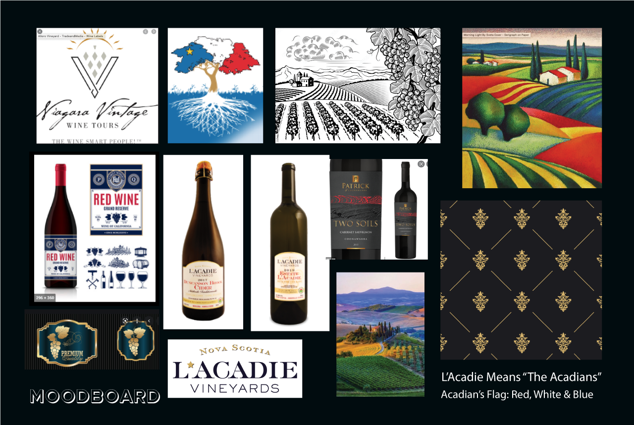
Moodboard
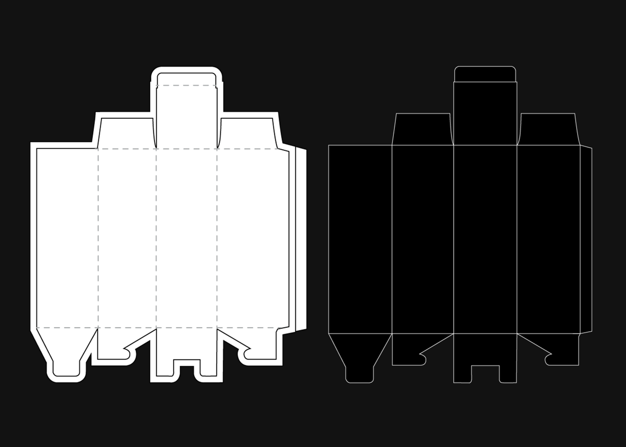
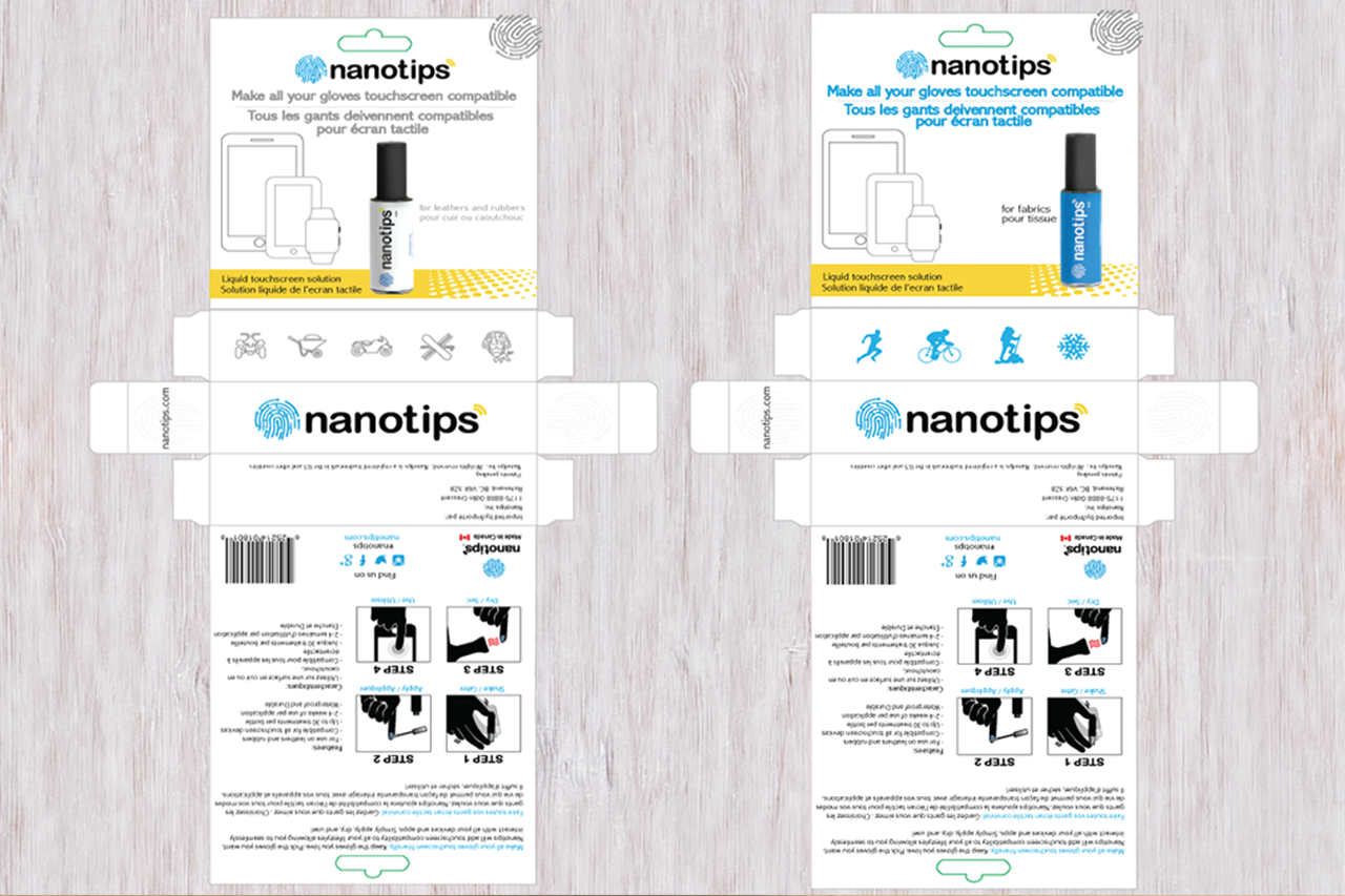
Dieline Packaging
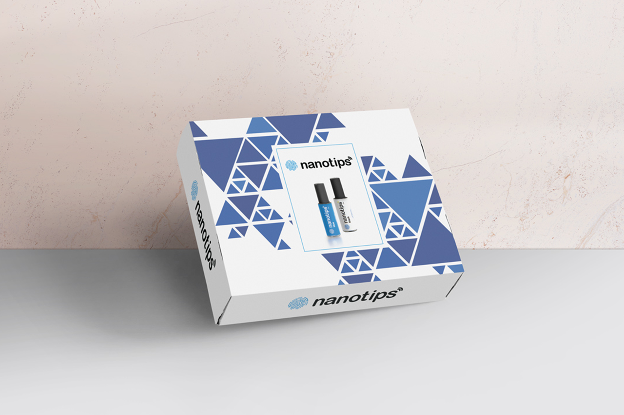
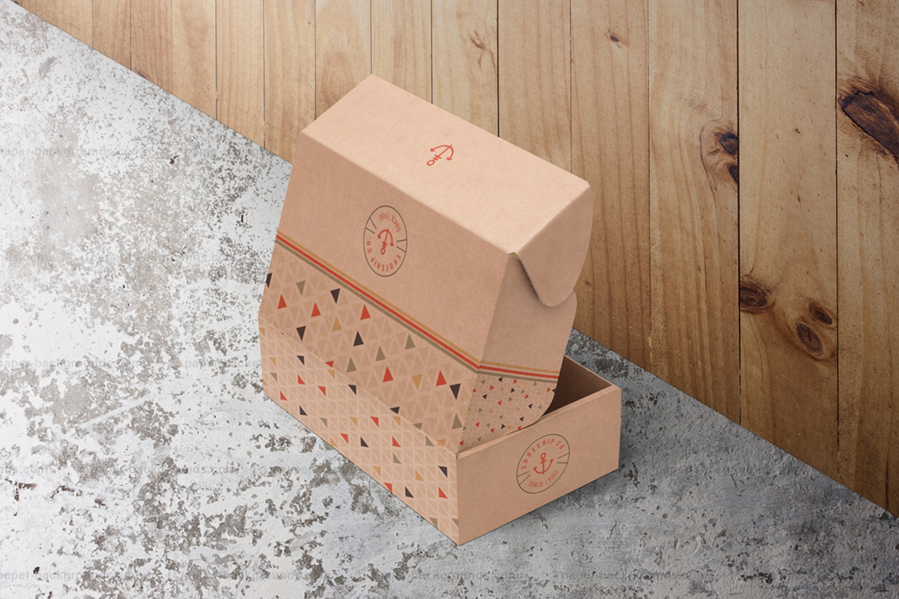
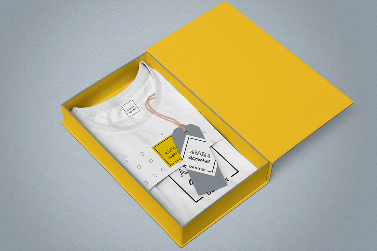
OTHER PACKAGING PROJECTS

