Explore the timeless tradition of gifting, rooted in human civilization's origins. From cavemen exchanging unique rocks and animal teeth to modern-day celebrations like Christmas and birthdays, the act of giving has evolved to strengthen social bonds. Witness the progression from simple expressions of appreciation to the elaborate and decorative gifts that now define our diverse reasons for exchanging tokens of affection.
OVERVIEW
This project focused on developing a cohesive brand identity and guideline system that ensures consistency across all visual and communication touch-points. The goal was to create a clear, scalable, and recognizable brand that reflects the company’s values while supporting both digital and print applications.
THE CHALLENGE
The challenge was to create a unified visual identity that maintains consistency across multiple platforms while allowing flexibility for various applications. The brand needed to be visually strong, recognizable, adaptable, and easy to apply—ensuring that all elements work together cohesively across different formats and use cases.
ROLE
Graphic Designer
Brand Identity, Visual System, Brand Guidelines
Brand Identity, Visual System, Brand Guidelines
APPROACH
The brand was developed through a structured design process focused on clarity, consistency, and usability:
- Explored brand direction through visual research and concept development
- Defined core brand elements including logo usage, typography, and colour palette
- Established a consistent visual system for scalability
- Created a brand guideline to support proper usage across all applications
- Designed supporting assets for real-world application
BRAND CONCEPT
The brand was designed to communicate a clean, modern, and professional identity, balancing visual appeal with clarity and functionality. The direction ensures the brand remains approachable while maintaining a strong and recognizable presence.
LOGO SYSTEM
The logo was designed to be simple, versatile, and easily recognizable across various formats and sizes. Multiple variations were created to ensure flexibility while maintaining consistency.
LOGO SYMBOLS/INITIALS ICON
The Creative Loft logo symbol incorporates the Noelan Script font, elegantly connecting the capital letter "C" and the lowercase "l." The inclusion of a heart shape at the end conveys the profound meaning of gift-giving. This distinctive heart symbol not only graces the logo but also finds a place in the title. It serves as a potent image, symbolizing the culture of design services and the interconnectedness of communication's strength and its various influencing factors.
LOGOTYPE OR TITLE
"The Creative Loft" title employs two typefaces to convey its distinct personality. The word "Creative" features Noelan Script, carefully selected for its clean, modern, sophisticated, and empathetic aesthetic. This typeface, with swirly or curved initials and terminals (which represent gift ribbons), adds a creative flair to the overall design. The other font, Sans Serif Lato (Regular), is used for "THE" and "L FT." This display font exudes a clean, warm, and sleek feel, ensuring high legibility.
The overall logo title maintains consistency with Noelan Script, while the "LOFT" word incorporates a heart shape in place of the letter "O," emphasizing the act of giving to loved ones. The chosen corporate colours, Yellow and Grey, blend seamlessly to create a fresh and captivating palette. This combination reflects a modern, chic, classic, and timeless vibe, aligning perfectly with Creative Loft's brand identity.
TYPOGRAPHY
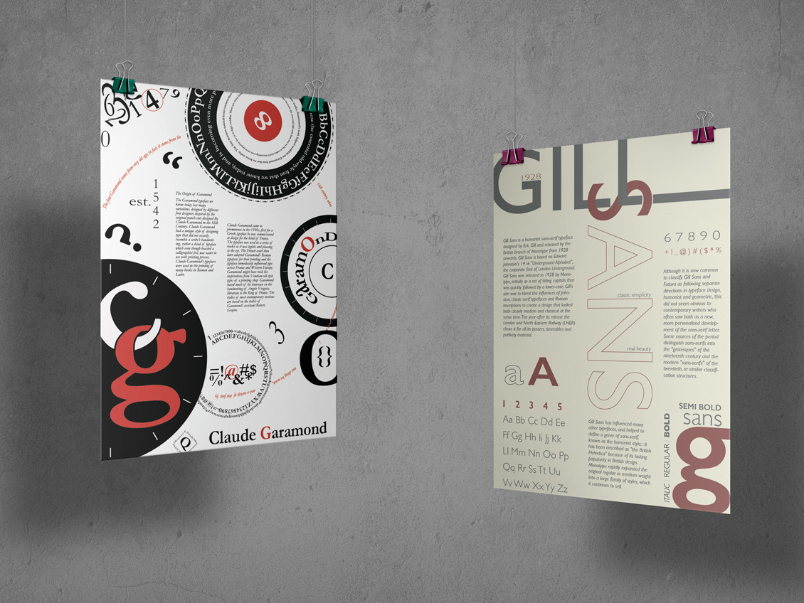
Typography was selected to balance readability and brand tone. The combination of fonts supports clear communication while reinforcing the brand’s visual identity.
COLOUR PALETTE
A cohesive colour palette was selected to reflect the brand’s personality and ensure visual consistency across all touchpoints. The colours were chosen to work harmoniously in both digital and print environments.
BRAND APPLICATIONS
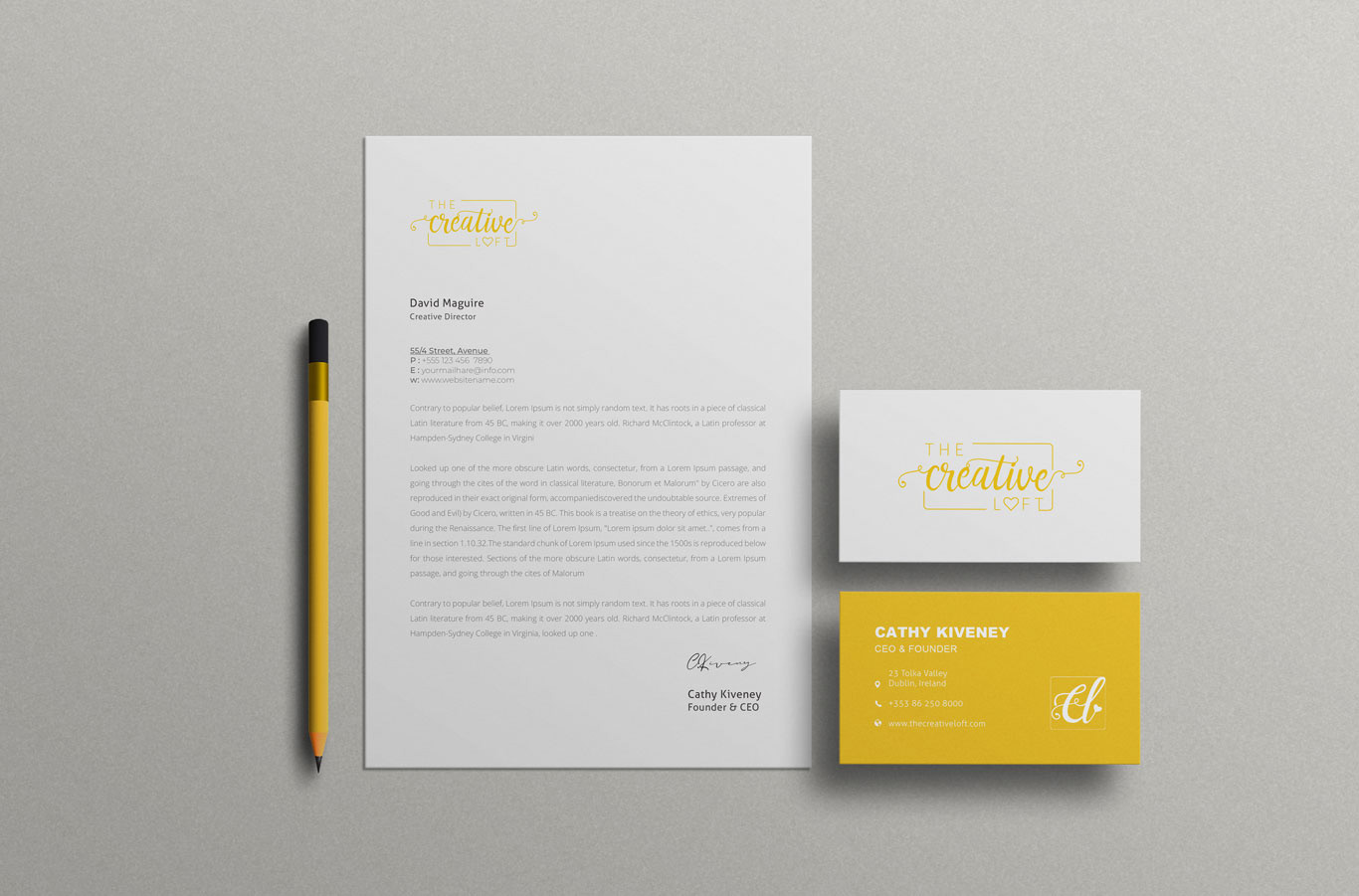
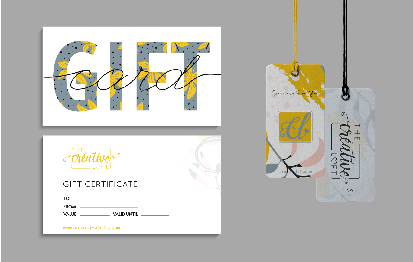
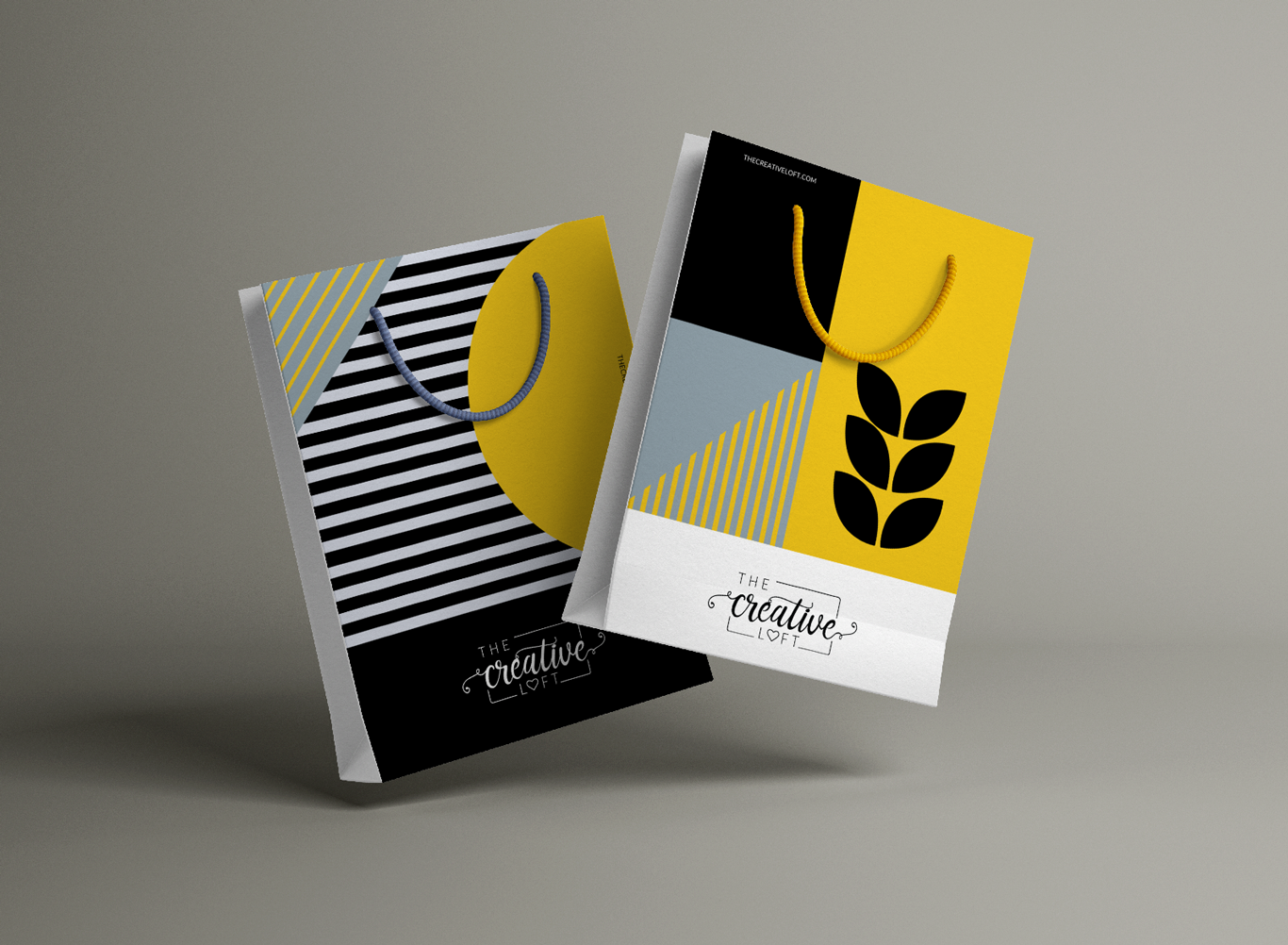
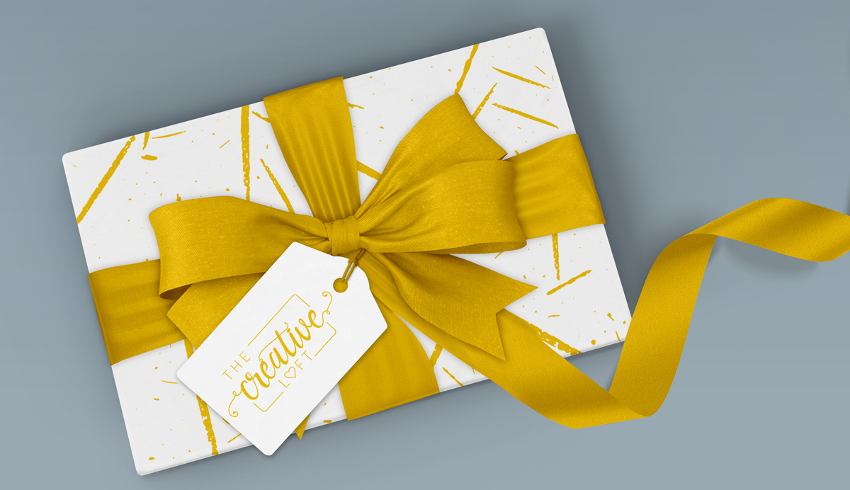
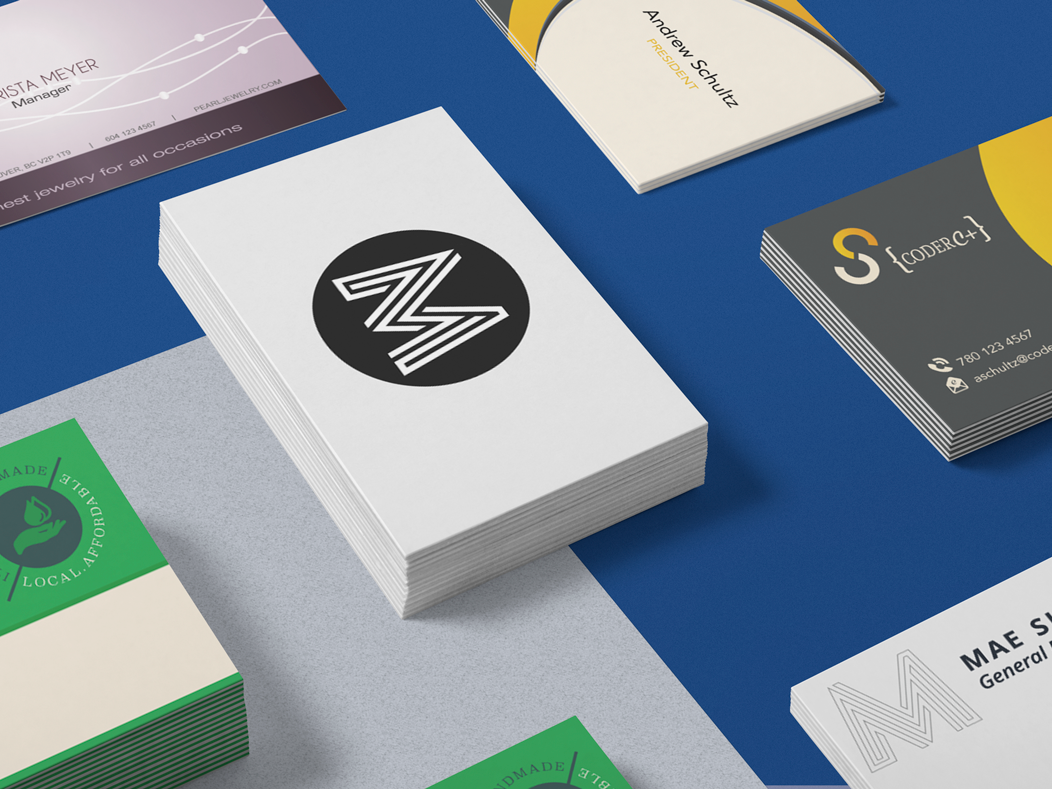
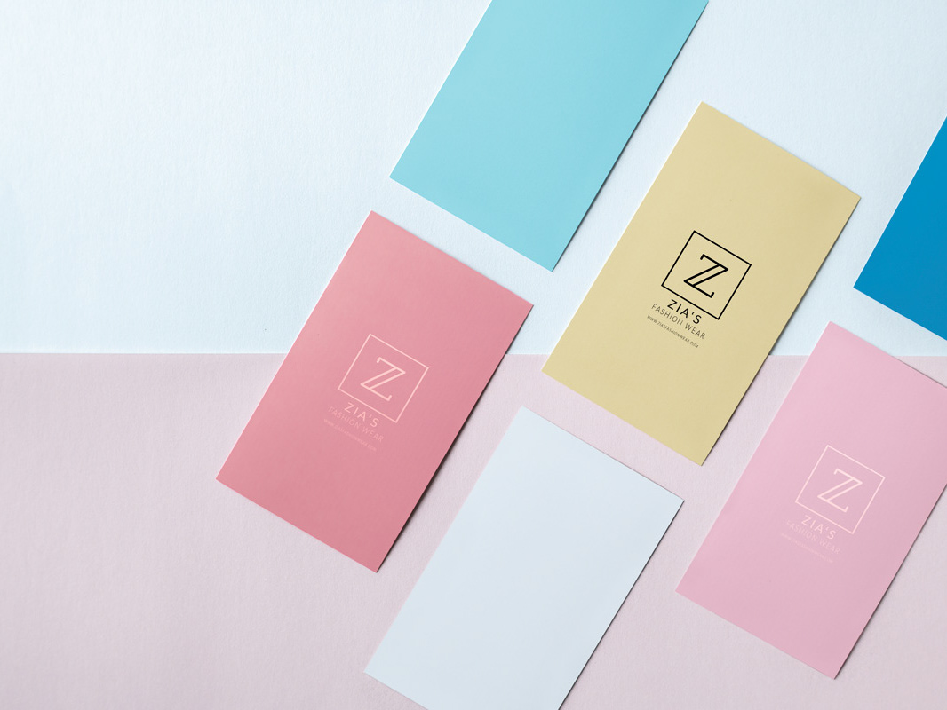
The brand system was applied across various touch-points to demonstrate flexibility and real-world usability. These applications ensure the identity remains consistent while adapting to different formats.
BRAND GUIDELINES
A structured brand guideline was created to ensure consistent use of all visual elements. The guideline provides clear direction on logo usage, typography, colour application, and overall brand consistency.
Below is the detailed 48-page Brand Style Guide Manual for Creative Loft in PDF format by clicking the button below.
RESULT
The final brand identity delivers a cohesive and scalable visual system that strengthens brand recognition and ensures consistency across all applications.
The guideline provides a clear foundation for maintaining the brand as it grows, supporting both current needs and future expansion.
THE MOCKUPS
